ShopDreamUp AI ArtDreamUp
Deviation Actions
Juxtapositions Tier
Access to select digital products from my Patreon, Mix'd Juxt, and Ko-Fi sites. This includes stock, digital printables, coloring pages, SVG files, digital patterns and more. Perhaps even CSS.
$3/month


Suggested Deviants


Suggested Collections


You Might Like…


Featured in Groups

Description
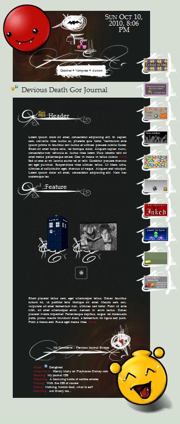
Possibly one of the best journals I've designed yet!
View it Live! -----> [link]
This was created as a prize for =SparklyDest for her entry in the Think Pink V contest held annually by `JunkbyJen. :devspaklydest: won third place in Artisan crafts, go congratulate her!
I am uber proud of this one. It's a personalized skin, which features her OC emotes, Death and Gor. I actually made the big ones, which making emotes is not my strength. I was quite pleased with how these little balls of joy came out ;D
So what's so special about this journal? If you will kindly take notice (I know the preview is kinda small to see, you may have to have a gander at the live view), the thumbs in different areas all have different skinning done. In the headers, they have none. The sidebar, they have their own special doodley smudge of scribble and the main thumbs get their own little squiggle. Instead of formatting the .shadow-holder field, which I would normally do, I formatted something for each different section. And as per =SparklyDest's request, I put in a remove bg tag for when she's featuring emotes.
Now this isn't as complicated as it would seem, though it does mean that this journal is a little more image intense, there is a total of 11 images.
The bg is formatted with a color, then layered on to are the header and footer, and another layer for the grain. I actually lessened the image count by two because I incorporated the separators into the header and footer. So glad I did! I uploaded her characters to DA, so she can display thumbs of them as she likes.


The live view explains all the intricacies and ins and outs of this journal. Which is actually, pretty non-complicated and user friendly, which I am striving to do for all my journals now. I will probably overhaul some of my older designs and reformat them to go with ease of use and versatility instead of formatting to fit my screen, etc. This journal was designed to compliment smaller screens, uncertain how small
All textures and designs used were tablet drawn by me. No stock used. Used her characters and multiple depictions of them as reference.

Featured in the preview image above:


View it Live! -----> [link]
This was created as a prize for =SparklyDest for her entry in the Think Pink V contest held annually by `JunkbyJen. :devspaklydest: won third place in Artisan crafts, go congratulate her!
I am uber proud of this one. It's a personalized skin, which features her OC emotes, Death and Gor. I actually made the big ones, which making emotes is not my strength. I was quite pleased with how these little balls of joy came out ;D
So what's so special about this journal? If you will kindly take notice (I know the preview is kinda small to see, you may have to have a gander at the live view), the thumbs in different areas all have different skinning done. In the headers, they have none. The sidebar, they have their own special doodley smudge of scribble and the main thumbs get their own little squiggle. Instead of formatting the .shadow-holder field, which I would normally do, I formatted something for each different section. And as per =SparklyDest's request, I put in a remove bg tag for when she's featuring emotes.
Now this isn't as complicated as it would seem, though it does mean that this journal is a little more image intense, there is a total of 11 images.
The bg is formatted with a color, then layered on to are the header and footer, and another layer for the grain. I actually lessened the image count by two because I incorporated the separators into the header and footer. So glad I did! I uploaded her characters to DA, so she can display thumbs of them as she likes.
The live view explains all the intricacies and ins and outs of this journal. Which is actually, pretty non-complicated and user friendly, which I am striving to do for all my journals now. I will probably overhaul some of my older designs and reformat them to go with ease of use and versatility instead of formatting to fit my screen, etc. This journal was designed to compliment smaller screens, uncertain how small
All textures and designs used were tablet drawn by me. No stock used. Used her characters and multiple depictions of them as reference.
Featured in the preview image above:
Image size
367x860px 72.34 KB
Date Taken
Oct 10, 2010, 8:07:42 PM
© 2010 - 2024 gillianivyart
Comments26
Join the community to add your comment. Already a deviant? Log In
The stamps overlap the body text, the body text doesn't "morph" if the journal is too narrow and ends up getting cut off, and the images of those two emoticons (I'm assuming) also get cut off at the edges.
Just what I noticed that could be improved")
Just what I noticed that could be improved